
Another day, another major public transport failure. I didn’t think the bus strike was having much of an impact until I got into the office and had a look at the statistics.
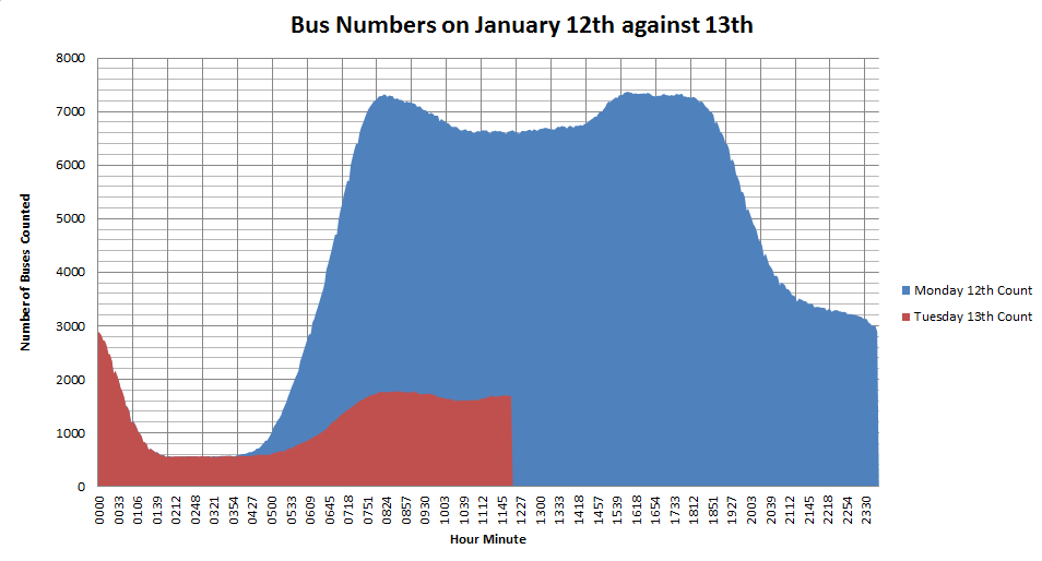
The graph above shows the number of buses running on the two days using the same horizontal time axis, so 0915 is a quarter past nine on both days. The red graph shows the comparison of how few buses are running. From the data, I can calculate this as about 24%.
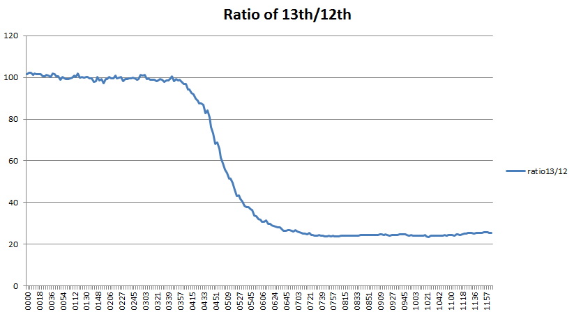
By plotting the ratio of the number of buses running on Tuesday (strike) divided by the number on Monday (no strike), the fall off in numbers from around 4am this morning is visible. From around 7am until 12pm, this levels off at about 24%.
The numbers don’t tell the whole story, though:
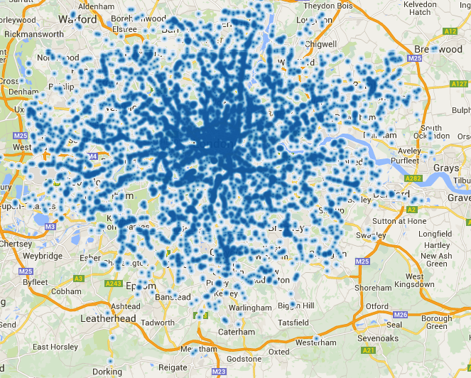
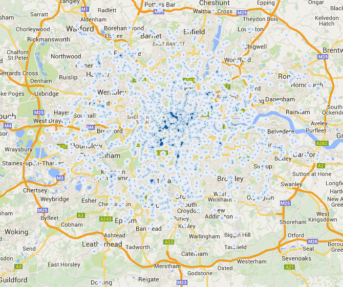
It looks as though there are more buses in London than in the suburbs, but it’s not showing the huge gaps we saw during the May 2012 strike which were caused by only selected unions striking.
Both these maps are online on MapTube at the following link:
I think the projection of some of the data is a little off perhaps? Or maybe it’s another issue? See here for example:
As you can see, the buses should be going up and down the Walworth Road, whereas it appears they are on the train track?
Cheers
James
The projection is fine, but the bus positions are approximations based on straight line interpolation between bus stops. It’s most obvious where buses cross rivers and miss the bridges. Also, some of the buses are actually river boats because the data is on the same TfL Countdown system, so they should be in the river.
I’ve also just changed the colour scale of the strike day heatmap to blue as the original red/yellow version was horrible.
Actually, I think it’s to do with the heatmap visualisation, not the projection. The positions of the heatmap centres seem to be slightly out with respect to the bus positions, but it’s not a consistent error. The bus positions are using lat/lon coordinates, so reprojection into Mercator is easy. I’ll have to look into it a bit further, but that seems to be why the buses aren’t following the roads in places. You can’t see it unless you’re zoomed into an individual bus though, which is probably why it hasn’t been picked up before.