
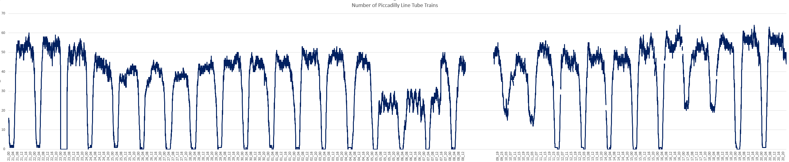
It seems that the Piccadilly line is only just getting back to normal after a problem with flat spots on the wheels of 50% of the trains: [TfL Link].
Looking at the data for the number of trains running, this seems to stem from around the 24th November (Thursday) when the numbers started to drop off. Analysing this data is problematic because of the noise inherent in the data collection process and the need to take weekends into account. There is also the launch of the Night Tube on the Piccadilly line which happened on Friday 16th December.
Plotting the total number of tubes running over a 24 hour period as a moving average makes things a bit simpler:
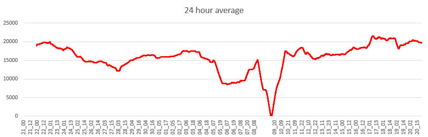
The data break is immediately evident on the 8th and 9th December, but the numbers can be seen to be dropping from the 23rd to the 28th. Then the 5th, 6th and 7th of December (Mon to Wed) just before the data break is particularly bad. It’s interesting to note that there were more tubes running on the 10th and 11th of December (Sat/Sun) than there were running on the 5th and 6th (Mon/Tue), which seems to be the worst period for the Piccadilly Line.
While this is quite an interesting exercise, the real value of this type of analysis is in the effect it has on the commuter. Spacing between tubes of 15 minutes were reported and sections of the line had no service at all. What I need to develop now is a way of generating these spatial analytics automatically from the data as we collect it.