
As part of my PhD I’ve been looking at a lot of real-time data about tubes, buses and trains. In fact, I probably started from the point where I already had a lot of data and was wondering what to do with it. While I would not class this as “Big Data”, the complex nature and real-time element make it difficult to analyse and visualise.
The image above shows the bus network displayed using my virtual Earth viewer. Having previously done a lot of work on the tube network, it only took about half a day’s work to get the buses into the system. One reason for this is that I’ve implemented an agent based modelling system (ABM) similar to NetLogo, so I just have to write the code to load agents and links from CSV files (easy!). The simulation is a bit harder to do, but not much.
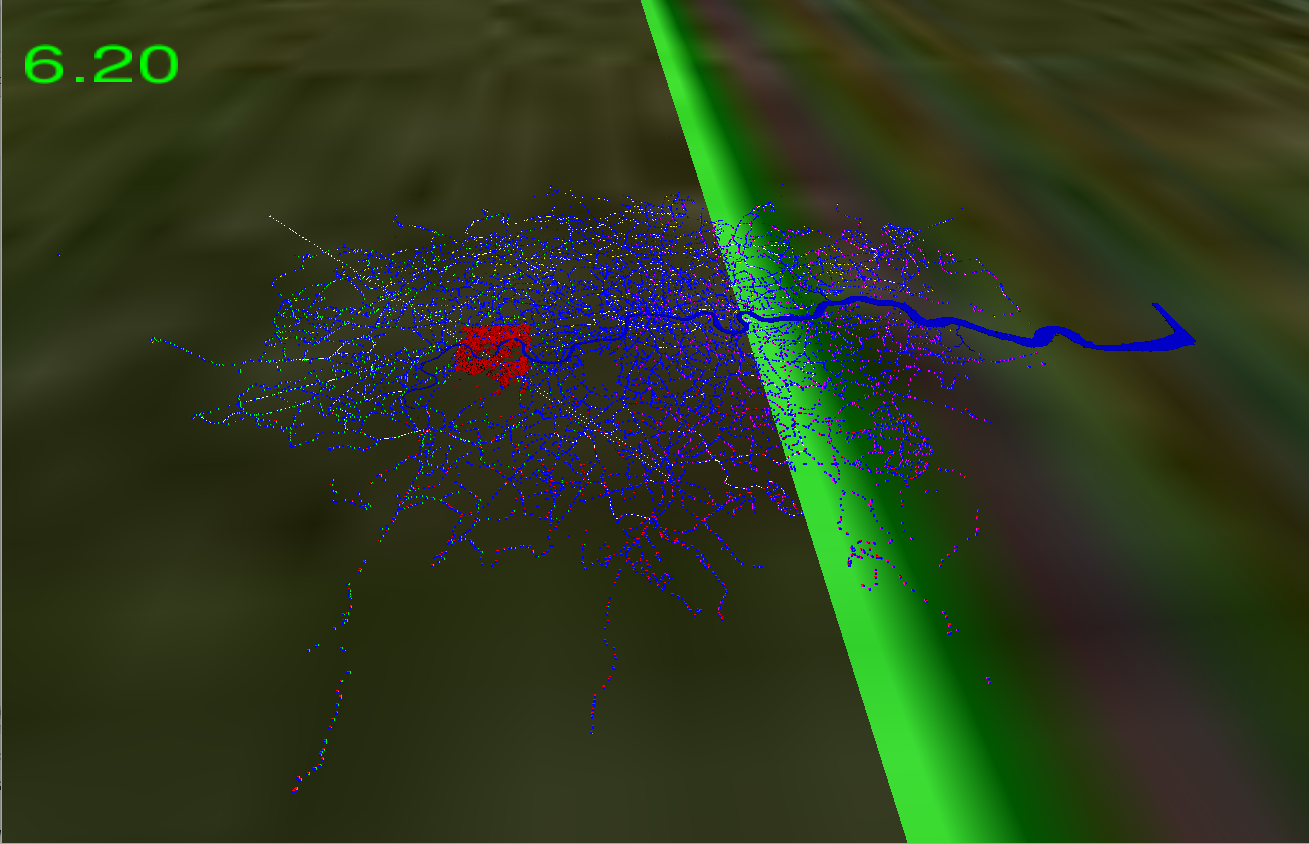
Although I knew the bus data was about 10 times bigger than the tube data, what I hadn’t bargained for was the fact that there are 21,987 bus stops (agent nodes), 53,896 route points (links) and up to 7,000 live buses (moving agents). The other weird thing is that TfL seem to be missing 409 bus stops from their master list as there are stops contained in the routes that I don’t have positions for. There are also a lot of invalid lines in the data that look as if there has been an error extracting the data from a database. I had a really interesting discussion with last Thursday’s visitor about that fact because he couldn’t believe it. I think I’m right in saying that there is a theory about complexity that goes along the lines of “any sufficiently complex data analysed deeply enough will always show inconsistencies”? In other words, we just have to deal with it.
Putting in some buildings gives a much better appreciation of just how big:
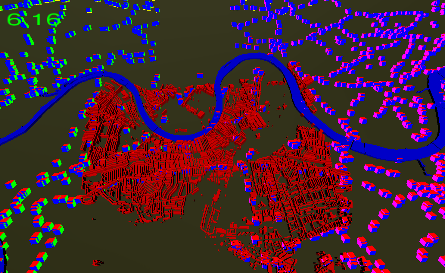
If you look closely, you can just see the bus stops in the river which are pontoons for the boats. The coloured cubes representing the stops are all 100m on each axis. It now all gets worse, because that graph containing 53,896 route points has to be fragmented using the road network and a routing algorithm to make the buses travel along the roads or rivers. I’ll have to implement this just as soon as I get the data displaying at a reasonable frame rate.
To really put things into the correct scale, and thinking of the highways agency’s UK wide road network, which is on my list:
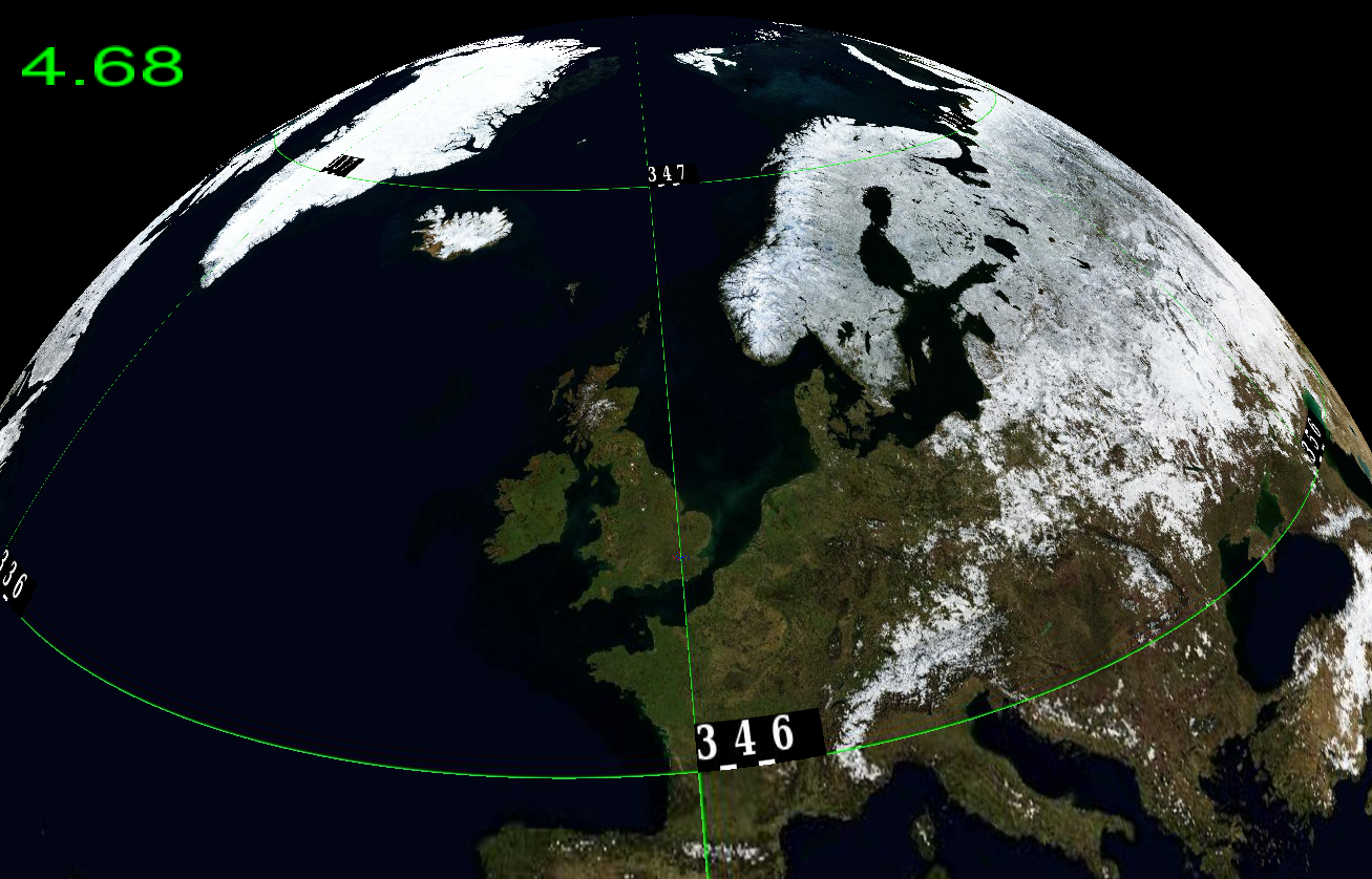
I just like the Winter Blue Marble image, which you don’t see very often. The Google Earth images are all the Blue Marble composite.
So, getting back to the PhD topic, which is about the algorithms which make all of this work, I obviously need to improve the graphics a lot, but most of the building blocks are now in place. I’m a graphics programmer, so the graphics engine is obviously hacked to pieces and I need to tidy it up. All the numbers in the top left of the images are the frame rates, which should be a lot higher than about 4-6 frames per second. If you take the geometry representing the bus routes (links), it’s a mesh with over 6 million points, and it’s taxing my graphics card a bit. Top of the range GPUs these days will do over a teraflop, which used to be supercomputing territory not long ago, but use them in 64 bit mode and the performance drops drastically. I still have some shader tricks to use which will improve the ABM performance a huge amount.
Finally, I have to answer the question, “what’s the point of it all?”. I wanted to analyse real-time dynamic data using a system that allowed me to explore the data visually in both time and space. Why is there a bus route from NW London going diagonally across to the SE in the first image? You can just see the white line going through the buildings, but it looks like an error in the data. Programming the model to simulate the buses allows you to explore the real-time element, but the aim is to have more in the way of analysis and data-mining than the simple widgets you get with NetLogo.
Now I have two networks, my first question is to look at how they compare to each other. I have the whole of 2014 to use for the analysis and a tool which (might) now let me do it.
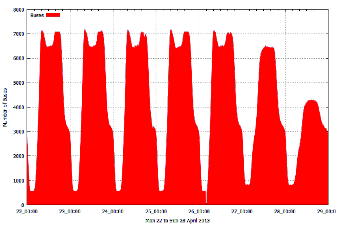
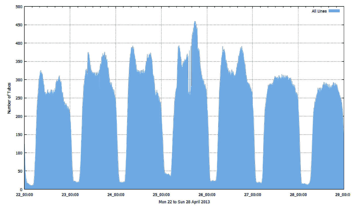
I’ve always wondered whether the peaks in the bus, tube and train numbers occur at the same times and whether there is any spatial variation?
Just as an update, here’s a movie I uploaded which shows the bus network much better than any words can: