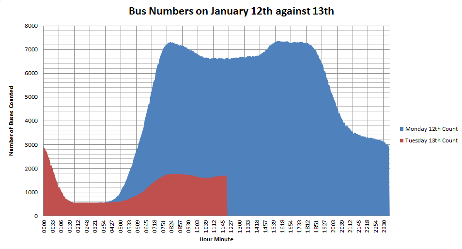
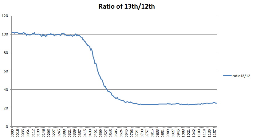
Just for completeness, I’ve updated the two graphs of the numbers of buses running on 13th January with the complete set of data up to 23:59 that night.
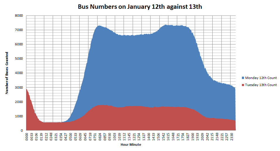
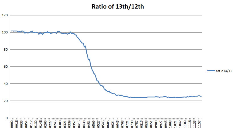
The first graph shows the total number of buses running on Tuesday 13th (red) against the previous day (blue). The second graph shows the ratio of red/blue*100%, or what percentage of a normal day’s buses were running? It levels off at around 24% quite definitely and never reaches the 33% which is the official TfL figure for the percentage of services running. The mean value for 7am to midnight works out as 23.7%, so either TfL have a different way of calculating the figure, or our data is wrong. This is something I’ve been wondering about for a while now, as we assume the data from the TfL Countdown API is accurate, but have no independent cross check. Coding errors can also lead to data issues and we know that during the last tube strike lots of extra buses ran which didn’t have the “iBus” tracker on them and so didn’t show up on our data. Having said that, there is nothing to suggest a problem with the data.
One other thing I was wondering about was what effect the strike would have on tube overcrowding? Having seen a news report from Vauxhall bus garage the previous day, I realised the huge number of people this was going to affect. If you’re a commuter changing trains at Vauxhall, then your logic goes something like this:
1. “There is a bus strike, so everybody who normally catches a bus from there is going to try to get on the tube. The tube will be packed.”
2. “There is a bus strike, so the delivery of people by bus to the tube station will be much lower than normal. The tube will be empty.”
It’s all a question of numbers, but, at the moment, it’s not something which have the data to even attempt to answer. But, by collecting data about unusual events like this, it might give us the insights into what happens on a normal day.