Somebody managed to do a SQL injection attack on MapTube recently, so it hasn’t been working properly for a while. Now that the vulnerability has been identified and fixed though, it’s back to normal again.
Looking through the logs, they’ve spent the best part of a month trying to do this, so I wish I had seen it earlier. It’s also been flagged by the main firewall as malicious.
I’ve had this idea for a while, but it occurred to me that we should be doing some spatial analysis on where all these attacks are coming from. They use groups of IP addresses which they change every day, but we have years worth of data now for a number of different web servers which could be analysed. The same applies to all the spam email that we’re filtering out. Just looking at the web server logs for this morning from midnight to 9am, there were 15 potential attacks and there were also 39 the day before, so there’s a lot of potential data there if we started putting it all together. It’s all just information theory.
To mark the event I’ve added a new feature to the homepage which should make it more dynamic. Now, if I blog about any maps, they will automatically appear on the MapTube front page with the text, images and map links extracted directly from the RSS feed. Along with the ‘topicality index’, which places maps for data which is currently in the media on the front page, this should keep the website up to date with the latest events. It’s also telling me what information we don’t currently have so we can gradually fill the gaps in our knowledge.
I’m hoping to follow this up in the next month with some real-time data feeds and more interactivity on the maps.
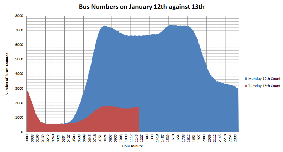
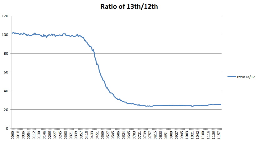
Just for completeness, I’ve updated the two graphs of the numbers of buses running on 13th January with the complete set of data up to 23:59 that night.
Numbers of buses running the 13th (strike) against the previous dayRatio of number of buses running on the 13th (strike) to the previous day
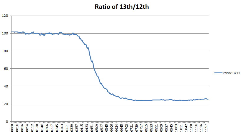
The first graph shows the total number of buses running on Tuesday 13th (red) against the previous day (blue). The second graph shows the ratio of red/blue*100%, or what percentage of a normal day’s buses were running? It levels off at around 24% quite definitely and never reaches the 33% which is the official TfL figure for the percentage of services running. The mean value for 7am to midnight works out as 23.7%, so either TfL have a different way of calculating the figure, or our data is wrong. This is something I’ve been wondering about for a while now, as we assume the data from the TfL Countdown API is accurate, but have no independent cross check. Coding errors can also lead to data issues and we know that during the last tube strike lots of extra buses ran which didn’t have the “iBus” tracker on them and so didn’t show up on our data. Having said that, there is nothing to suggest a problem with the data.
One other thing I was wondering about was what effect the strike would have on tube overcrowding? Having seen a news report from Vauxhall bus garage the previous day, I realised the huge number of people this was going to affect. If you’re a commuter changing trains at Vauxhall, then your logic goes something like this:
1. “There is a bus strike, so everybody who normally catches a bus from there is going to try to get on the tube. The tube will be packed.”
2. “There is a bus strike, so the delivery of people by bus to the tube station will be much lower than normal. The tube will be empty.”
It’s all a question of numbers, but, at the moment, it’s not something which have the data to even attempt to answer. But, by collecting data about unusual events like this, it might give us the insights into what happens on a normal day.
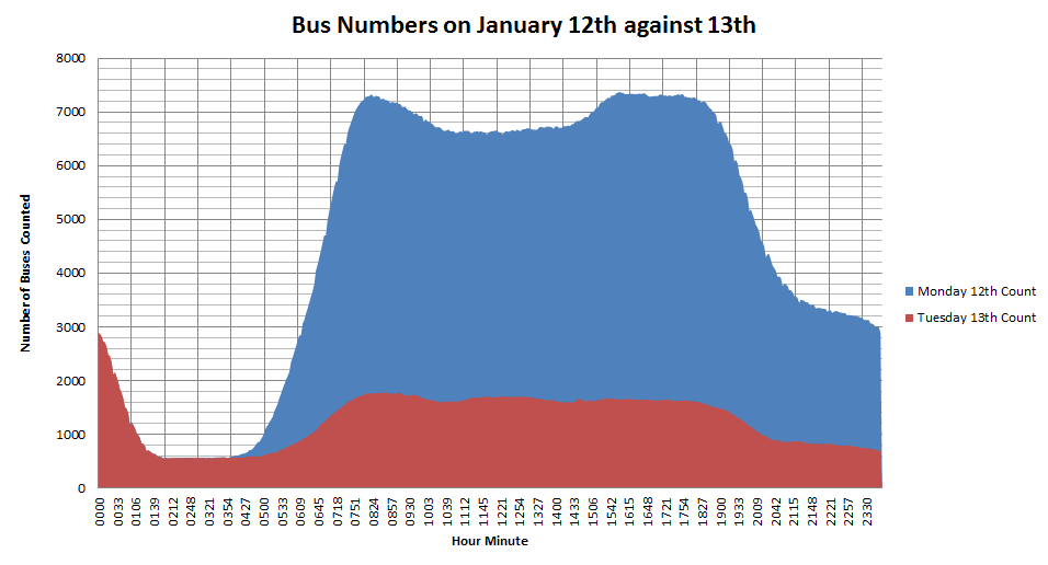
Another day, another major public transport failure. I didn’t think the bus strike was having much of an impact until I got into the office and had a look at the statistics.
Comparison of the number of buses running on the 12th January 2015 (blue) against the 13th (red)
The graph above shows the number of buses running on the two days using the same horizontal time axis, so 0915 is a quarter past nine on both days. The red graph shows the comparison of how few buses are running. From the data, I can calculate this as about 24%.
Ratio of number of buses running on each day
By plotting the ratio of the number of buses running on Tuesday (strike) divided by the number on Monday (no strike), the fall off in numbers from around 4am this morning is visible. From around 7am until 12pm, this levels off at about 24%.
The numbers don’t tell the whole story, though:
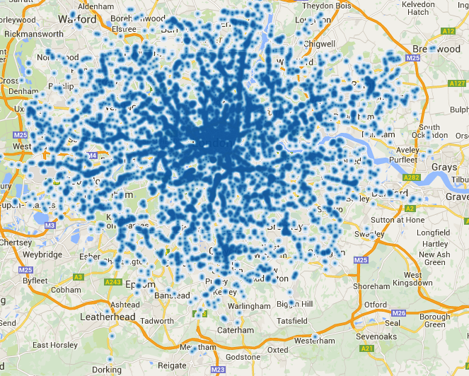
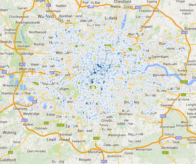
12 January 2015 09:00am bus heatmap13 January 2015 09:00am bus strike heatmap using the same blue colour scale as the normal day’s map
It looks as though there are more buses in London than in the suburbs, but it’s not showing the huge gaps we saw during the May 2012 strike which were caused by only selected unions striking.
Both these maps are online on MapTube at the following link: