As anybody who was trying to fly last Friday will know, a software failure at NATS caused the closure of UK airspace for 36 minutes between 15:27 and 16:03. The delays at Heathrow continued until Saturday as the system runs at 99% capacity and so has no spare capacity to recover from a failure.
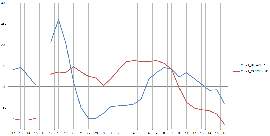
I have data from the arrivals and departures boards logged for Heathrow, Gatwick and City, but the Heathrow data was easier to handle, so I’ve plotted a graph of the effect of the shutdown below:
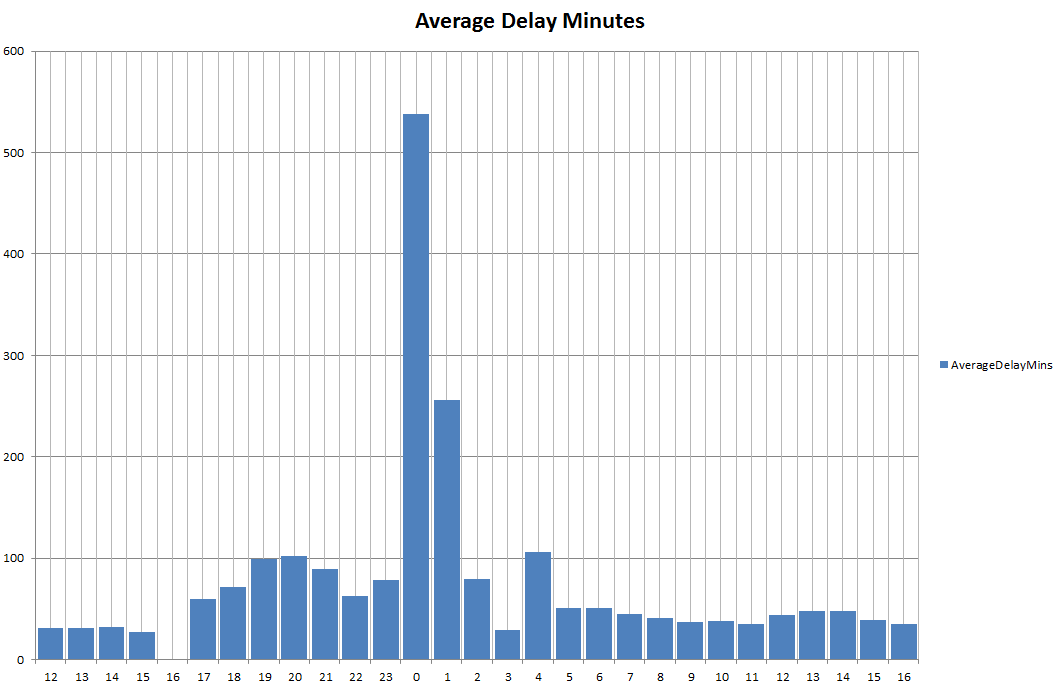
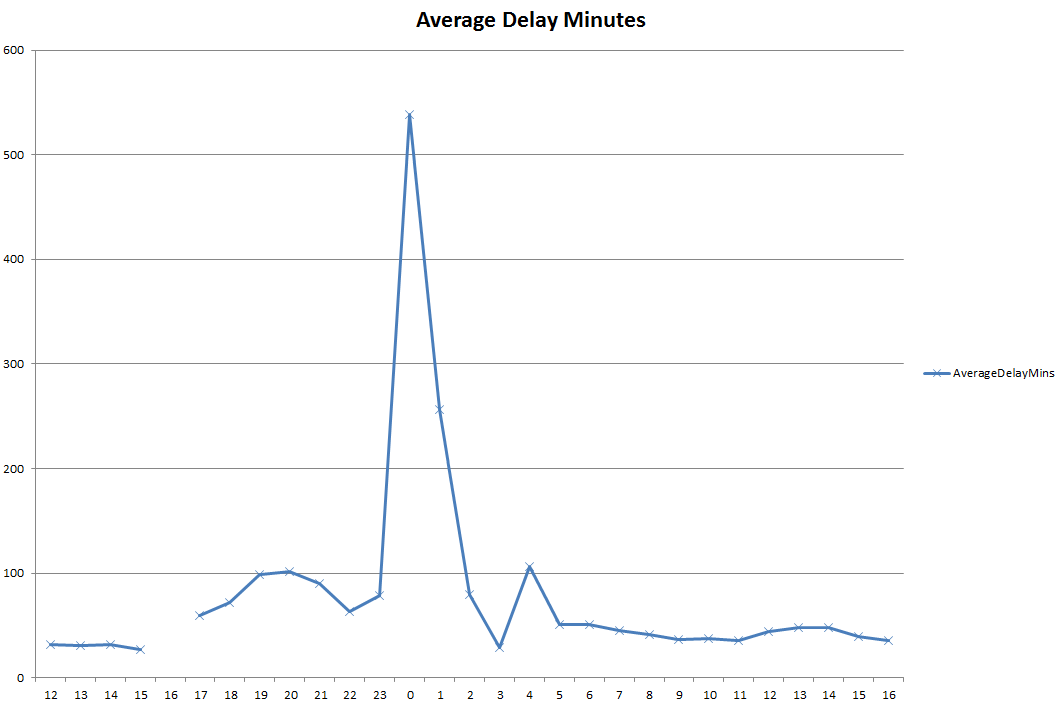
Both graphs show the same data, with the x-axis divided into hours. The fault with the air traffic computer system occurred at 15:27, but unfortunately, the 16:00 data is missing. This might be attributable to high demand on the web server giving information to passengers.
The other interesting feature is that the first peak occurs round about 20:00 on the 12th, then it looks like things are getting back to normal until midnight on the 13th, when there is a sudden peak of over 500 minutes. Looking at the data, this is accounted for by a large number of transatlantic flights (about 110) all arriving several hours late at around the same time. This might be a sensible option, as by delaying flights arriving from long distance, they can get the flights that didn’t leave earlier in the day out, then extend the airport operating hours to clear the backlog.
My main reason for showing this data is that I’ve attempted to analyse it before and failed. That time it was snow that caused the airport [link], but the type and complexity of the data is currently preventing analysis. The graphs above don’t show the number of planes being handled, or the number being cancelled. The data is also very dirty in the sense that it’s very difficult to analyse with a computer something that is a plain text description designed for a human. The status text can be something like “LANDED”, “EXPECTED”, “CANCELLED”, “CALL AIRLINE”, “TAXIED”, “AIRBORNE”, or “SCHEDULED”. Also, the delay minutes can be negative if a plane gets in early, so, in the data above, this pulls the average down. I don’t think this is significant, though, as far too many aircraft have delays of hours for a few minutes early to make much difference. This does highlight the other problem, which we also see with the rail data, where a delay of 10 minutes on a route that takes 40 minutes is more significant than 10 minutes’ delay on a train from Scotland to London. Similarly, with the airports data, transatlantic flights taking over 24 hours are hard to analyse side by side with European flights taking 1 or 2 hours.
Basically, I’m still struggling with how to handle this data and how to include it with all the other factors we have which show how well London is operating. I think that more work needs to be done on data mining the archive data to establish a reliable baseline and detection of significant features. Then the data fusion to bring the airports data in with all the other transport data can happen. It would be interesting to know whether the Victoria line problems were a knock-on effect of the Heathrow problem on Friday night.
Just to finish off, here’s another graph of the number of the absolute number of delays and cancellations over the same period. It’s interesting how the peak in delays occurs at 18:00, two hours after the problem has been cleared: